Logo Color Schemes
Logo Color Schemes
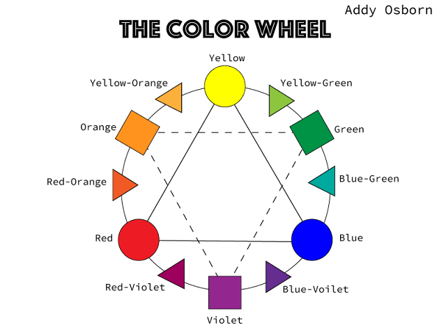
Analogous
This logo uses the analogous colors of orange, yellow-orange, and yellow. I think the company probably used these colors because they are really bold and bright. Orange and yellow are very eye-catching colors. It also looks kind of like a Mexican design an that convinces people that these are genuine chips and should be bought. The colors look really good with the design.
This logo uses the analogous colors of yellow-green, green, and blue-green. I think the company chose these colors because they are very natural, fresh, and clean looking. This organization probably wanted to seem pure and full of goodness and having calming, pleasing colors would help that along.
Complementary
This logo uses the complementary colors of blue and orange. I think that they used these because complementary colors naturally go together. Plus, the bright orange is very bold and represents energy. The blue contrasts it and makes it seem natural and confirming.
This logo uses the complementary colors of red and green. I think they chose to use these because they look very good together. The red is full of energy and draws people in and the green is soothing and makes the restaurant look very natural and fresh.
Warm
This logo uses the warm colors of yellow and red. These colors are exciting and bold and that makes sense because Red Bull is an energy drink. The colors just go with the design anyways.
This logo uses the warm colors of red and yellow. The company probably chose these colors because they catch people's attention. The "gold arches" symbolize being rich and in charge.
Cool
This logo uses the cool colors of blue and blue-green. I think the company used these colors because they are very natural and "fresh" looking. Ocean Spray wants to be very family-friendly and what more do parents want than for their kids to be healthy?
This logo uses the cool colors of blue-violet and blue-green. I think that they chose violet because it symbolizes power and nobility and Yahoo is a very big company with lots of money. The blue is bright and looks very nice with the violet.
Monochromatic
This logo uses the monochromatic colors of light, normal, and dark brown. I think they chose these colors because they wanted to catch people's eyes and is probably the only brown soda logo. I also think the may have wanted to seem, like, retro? Like old so it's doesn't have as much junk in it as new sodas do. Those are just my thoughts.
This logo uses the monochromatic colors of navy and light blue. I think they used these colors because they make SKC seem more friendly and trustworthy. Blues just kind of make you feel connected. Plus, they aren't too bright so they are perfect for their jerseys.
Triad
This logo uses the triad colors of blue, red, and yellow. I think that Burger King decided to use these colors because they wanted to be just a little different from the competitors, like McDonald's, Wendy's, or Hardee's. They added a little blue so their logo would be different and stand out, despite the bright yellow and bold red.
This logo uses the triad colors of violet, orange, green. I think they chose these colors because they would be very different from all other logos. They probably wanted to seem natural with the peach? in the background and the violet contrasts it very well. These just look so good together and I would like to buy whatever they're selling!


Comments
Post a Comment