Type Anatomy
Project Overview
The Project...
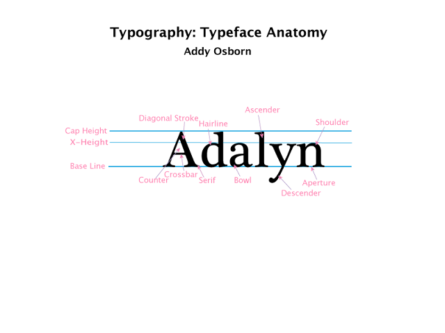
This was our third project for second quarter. We wrote our names in a serif font. Then, we added "Cap Height, X-Height, and Base Line" parallel lines so you can see the different heights of the letters. We added little typeface anatomy vocab lables to show the different bits of the letters.
What I learned...
We first learned about typography. We watched videos about how different fonts influence people; you wouldn't use a really childish font for a billboard or an office and everyone knows a bold serif font wouldn't look good in a first grade classroom. We studied the differences between sans serif and serif fonts. I never knew all the parts of a letter had names! It was really interesting to learn about all these things so we can reference and apply them in the future.
What I'd do next time...
I'm getting used to using Adobe Illustrator. I really love this application. It's so easy to use and I totally recommend it for beginner graphic designers, like myself. Maybe next time I would do my full name or use a different serif font. I think it turned out pretty good!


Comments
Post a Comment