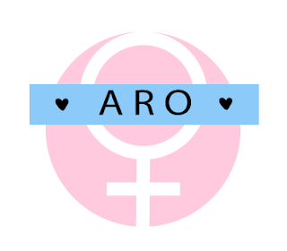
ARO Logo
ARO Logo
Project Overview:
The project... |
| (These are my black and white rough sketches.) |
 |
| (These are my colored versions.) |
The image at the top is my final logo.
What I learned...
I learned a lot more about Adobe Illustrator while working on this project. Everything was easier this time around, because I've used this application before, so I could focus on the actual logo. I also learned that shapes can convey meaning in design and lettering can have an impact on your logo. The coolest thing we discussed was the process of creating a logo and how it doesn't have to be hard work.
What I'd do different...
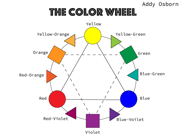
Maybe I would explore different color palettes next time. If I wasn't so indecisive already, I could have switched out the blue with violet. I might have tried to simplify the banner so it worked with my logo. I think it looks good now and I'm going to keep it that way until further notice.


Comments
Post a Comment