Typography Project
Pre-Production:
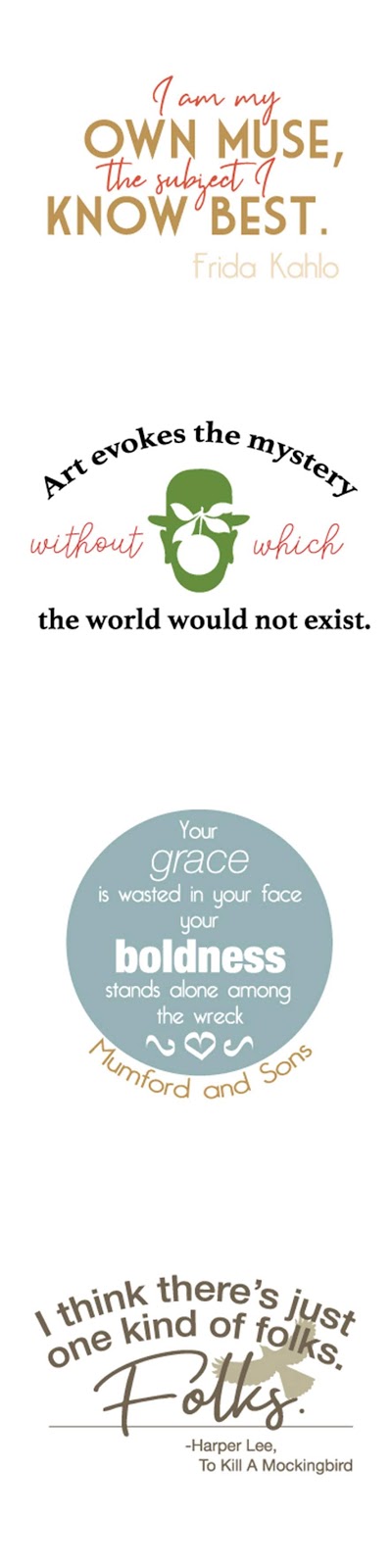
I chose a quote from a book, two from famous people, and one song lyric. For my first quote, I wanted to use a typeface that looked like handwriting and one that was very bold to contrast it. Frida Kahlo was an artistic and bold person so why not use fonts that showcase that! On the second one, I decided to keep it pretty simple since there was a lot going on with the image in the middle. I did, however, make it a little more interesting with the curly font. I was pretty literal with my third one, a song lyric. I made the word "grace" thin and italicized and "boldness" thick and, well, bold. Similar to my second one, I wanted to make the text pretty easy to read but for the word "folks," I tried to use a font that looked handwritten and old.
Production:
I sort of preferred working in black and white because you could see the plain version. There wasn’t any interference with color so I could just focus on the layout and type. I think it’s important to start with black and white because it helps with CARP. I learned that you can’t change the type (like the color or the font) after you’ve already warped it. That was a little frustrating when it came to editing my black and white versions because they were already finished and I had to redo it.
Post-Production:
I think my designs turned out pretty good, especially for not really doing typography before this. I would change some of the colors, specifically on my Rene Magritte quote. I don’t love the text on the Mumford & Sons lyric so I would probably edit that a little bit.

Comments
Post a Comment