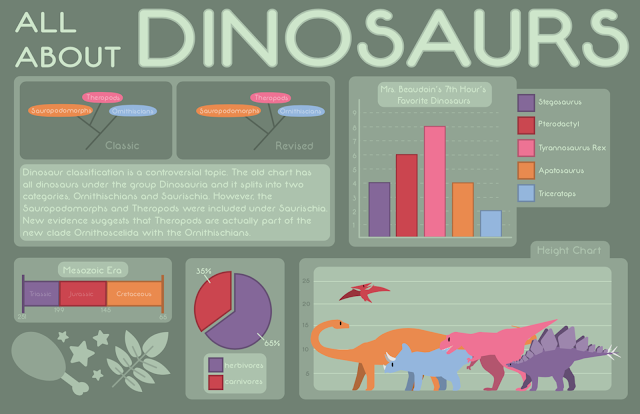
Vector Illustrated Portrait
 |
| The finished product! |
Pre-Production:
I went home and looked through photos and made a folder of ones that I liked. I talked with my teacher and got her opinion, I couldn’t make up my mind! She helped me decide on a photo of my cat, Cece. She has a lot of different colors so I figured that would be interesting to recreate. My teacher also suggested that I do the “organic” version of a vector portrait, versus the triangles. Before I began, I had to posterize my image. I put it into Adobe Photoshop and used the Posterize tool in the Adjustments panel. I moved the slider to the place that I liked. I exported the JPG and opened it in Adobe Illustrator. I made two artboards, one for the posterized image and one for my work. I copied the edited photo over to the second artboard and changed the opacity, so it would be easier to work on. Then I was ready to begin!
Production:
Creating this piece in Illustrator was pretty cool. I had never done anything like this so I did learn a lot while working. It took me a while to get used to the pen tool and the curve tool but I think I can use them much easier now. I used the eyedropper to pick colors from the photo which was new to me. Switching between the select tool and the eyedropper was actually pretty easy when I learned the keyboard shortcuts. I ended up putting the actual picture, pre-posterization, on my workspace so I could look at it and compare the two. I focused on making sure the markings were accurate so it helped to have the actual photo as a reference. Sometimes, I would have a problem with the shapes so I would simplify them as much as I could. I didn’t want to make it too busy with a ton of tiny pieces and shapes. I tried to emphasis Cece’s eyes as much as I could.
Post-Production:
I’m pretty happy with how this turned out. I think that it looks a lot like Cece. I did make a mistake with the colors though. I realized, at the end, that I had color picked from the transparent photo on my artboard. The opacity on this picture makes the colors lighter so my cat ended up too pale. Some of the colors are accurate but I wish I had realized my mistake earlier so I could’ve fixed it. I think that the background looks really good, it’s simple but it complements the focus. I really do like how it looks. I enjoyed the project and I think I’m going to do more vector illustrations in the future!
 |
| This is the original picture! |
Comments
Post a Comment